Background:
Scientometric mapping is a set of visualisation techniques developed in the field of scientometrics for the study of measuring science, technology and innovation activity and outcomes. Given that science, technology and innovation are processes that take place in all sorts of settings (firms, institutions, universities, hospitals etc), a key problem addressed in scientometrics is how to capture this activity and make it tangible. Often, research ‘output’ is measured using proxies such as publications, citations of published research, or patent applications. The advent of large web-based databases that capture publication, citation and other information, means that this data is now more readily available for analysis. The mapping procedure captures very complex processes, and portrays this information visually. Not only does this make it more comprehensible and easily analysed, but the dynamics – the change or emergence of something over time – can also be examined and represented. The Atlas of Science gives a nice accessible overview of this field and its potential (Börner 2010).
Scientometric mapping can help us to understand how emergence of knowledge fields or technologies happens. The role of relationships, research collaborations, funding and context, and the transfer or combining of assets in technology/ knowledge development can be explored in more depth. It is often conducted as part of larger studies – for example using qualitative methods – that ask why knowledge fields or technologies develop as they do. Together, this sort of knowledge can help inform more inclusive and critical engagements in science, technology and innovation policy.
What’s involved?
First, a suitable focus and level of resolution needs to be determined for study. Two broad approaches to scientometric mapping exist, called local maps and global maps. Local maps look at a specific technology or technique (such as a method for genetic mapping) and its development. Global maps seek to explore entire fields (eg: genetics) in relation to science or a discipline (eg: biological and health sciences) as a whole.
The technology/subject/topic of interest also needs to be carefully and clearly defined, considering changes over time, and establish where exactly the boundaries around your interest lie. Because the name of a technology or process can change with development or be different in different countries, and technologies or techniques often exist on continuums, you need to know exactly what you are looking for and to recognise it when you see it! This process, followed by defining exactly what search terms you will use to search publications or patent databases, is best conducted in collaboration with experts in the field of interest.
It is also important to be aware of the nature, process and motivations of scientific publishing and patenting in order to be sensitive to the biases in datasets, time-delays, and to develop successful search techniques and data sampling methods. Similarly, getting to know the databases you might search is helpful because different databases have slightly different tagging systems for the information they hold, which means that in some instances you might be able to refine your search more quickly than in others.
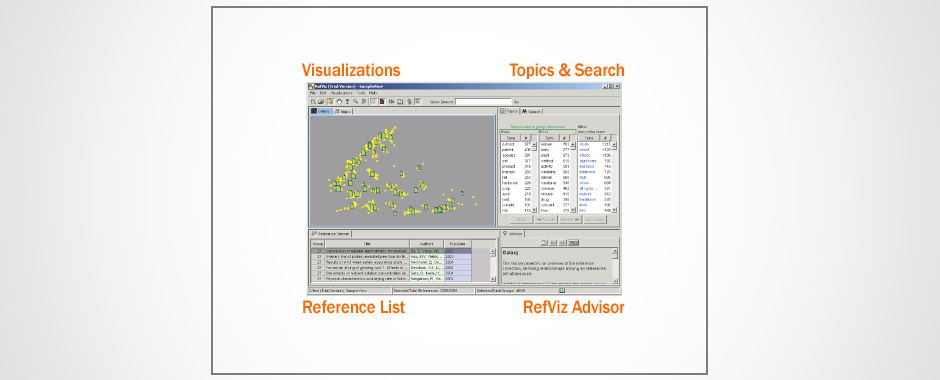
Maps showing the fields using RNA interference – a gene-silencing technique – over time.
Search strings (i.e. combinations of key words) or ‘controlled vocabularies’ (words or phrases used to tag units of information and organize knowledge for subsequent retrieval, for example as used in patent classification) are used to identify publications or patents within databases like Thomson-Reuter’s Web-of-Science (WoS), SCOPUS, MEDLINE/PubMED for publication data, and the United States Patent and Trademark Office (USPTO) and PATSTAT (European Patent Office Worldwide Statistical Database) for patent data. Files that meet your specified search terms can then be combed for the data you want – such as authorship, co-authorship, citations, institutions, countries, other key words and linked knowledge fields. Once this has been entered into a suitable database, you can then begin analysing this database and start mapping it.
Mapping can take different forms, and there is a diversity of free software out there with which to do this, such as with vosviewer, citnetexplorer, Pajek and Gephi. Statistical and social network analysis tools and metrics can then be used to analyse databases and maps.
Overlay mapping involves mapping the activity of interest (e.g. of a person, institution, sub-field) and laying this over a broader representation of geographical spaces (traditional maps), social spaces (e.g.inter-organisational networks) or cognitive space (e.g. all activity across the science publishing realm) (Leydesdorff, Rotolo et al. forthcoming).
Maps can be produced and interpreted in discussions with stakeholders regarding developments in your field(s) of interest. Stakeholders (such as professionals working in the field) are crucial for designing search strategies and interpreting the resulting pictures – bringing diverse experience and perspectives to bear in generating understandings of the driving dynamics of research, as illuminated by the mapping process.
Broadening Out and Opening Up?
Scientometric mapping creates a visual representation of nebulous but extremely important activities around ‘science’, ‘technology’ and ‘innovation’ that happen within institutions. This makes huge volumes of data tangible to analysis and therefore accessible to scrutiny. While it takes time and some resources, and you need to be in an institution with access to online facilities like the WoS, this does nevertheless broaden out the possible ways in which we can understand how science and technology develop. If this is done in ways that interrogate the data according to contrasting stakeholder perspectives as to what is relevant and important, then the picture is further broadened out.
If clear visualisations are used to convey the implications of these different pictures of science technology and innovation to wider policy debates, then the sector is correspondingly opened up to reveal more complexity, nuance and variability than is typically the case. However, the truly participatory qualities of this process are likely to be severely restricted by the technical nature of the data, and analytical process involved in its creation– creating a bias towards those with the skills and knowledge to engage with the method. So care is needed with any claims that might be made. Nonetheless, there are opportunities in the process of map creation – such as in determining what is looked at, which key words are used, and how maps are to be interpreted – to involve a broader constituency of stakeholders.
Fits and Limits
Mapping takes the complex and multi-dimensional process of science and collapses this into 2-3 dimensions, in order that we can visually access it. There are therefore many decisions and unavoidable limitations in the mapping process that will affect the results you obtain. For example, how the technology/technique of interest is defined, how you aggregate and categorise data, the information you are and are not able to capture. The current sources of information for scientometrics are large databases of funding, publications and patents. This will capture a very particular type of science and technology – formal, institutional, mainstream, disciplinary and corporate. Collecting data this way will not be sensitive to the other realms (often the marginal and alternative) within which science, technology and innovation occur – hackerlabs, farms, civil society groups, internet and computing innovation such as through open-source software, work-place tinkering and trial and error, and myriad other instances. It is worth noting, however, that what can and cannot be explored by mapping is changing as this approach develops. More sources of information are becoming amenable to ‘harvesting’ such as websites, twitter and funding databases, opening up greater opportunities for visualisation.
References and other useful sources of information:
Börner, K. (2010). Atlas of Science. Vizualizing What We Know. Cambridge, MA., MIT Press.
Leydesdorff, L., D. Rotolo, et al. (forthcoming). “Interactive overlay maps of medical innovation based on ‘diseases’, ‘drugs & chemicals’, and ‘techniques & equipment’ among the medical subject heads of PubMed.” Journal of the American Society for Information Science and Technology.
 To find out what software was used in this area, please click here; for scientometric tools, follow this link.
Credit
Material for this vignette was contributed by Dr Becky White.
Featured image source: MIT